Final project report
Your final report will be in Jupyter notebook format, where you will both write the content, and the code necessary to load, preprocess, analyze, and visualize the data. I recommend you follow this outline:
Title Abstract: in about 120 words state the following:-
The general topic of study and its importance.
Your research question.
Very briefly summarize your results.
How your results will change the way we go about the topic of study.
-
The background to your work, why it's interesting to you and should be interesting to others.
Whether other people tried to answer similar questions to yours and how they went about it.
How your question fits in given the background and other people's work.
-
What datasets are you using and why.
How you obtained these datasets.
Summary statistics (how many rows, what are the columns that you will use in the analysis; other summaries specific to your data: gender and age distribution, number of teams, countries, diseases, etc. and amount of data about each)
Important: None of this should be only hard-coded as markdown; your notebook should have the code that calculates these numbers when you run it. Preprocessing: do you discard any data and why.
-
Did you manage to answer the questions, if you had more time what would you do better?
What are the ways the data could be incomplete or biased?
Given your stated research interest as well as the limitations, shortcomings, and biases of the data, what are the potential side effects if we actually acted on what we learnt?
Data analysis and visualization with Jupyter notebooks
Today we will combine loading data from files and visualizing it using matplotlib and jupyter notebook, with a brief introduction to statistical analysis. We will explore the interplay between the BlueBike usage and weather: do people bike less when it's windy or when it rains? do people bike more when it's warm?
Recap on loading files
We have previously learnt how to load comma-separated value files using a for loop. This method works in most cases, but it's not always optimal: sometimes there are encoding problems (you will get a UnicodeError) when there are non-English characters in the data, sometimes strings are surrounded by " marks and you'd have to remove them to work with the data, etc.
In such cases you might want to use the csv library and load the files like this:
data = []
with open(filename) as csvfile:
csvreader = csv.reader(csvfile, delimiter=',', quotechar='"')
for line in csvreader:
#now each line is already clean and split into fields
#so no need for .strip().split(',')
data.append(line)
Exercise 1: Loading the data
In this exercise we will be loading data from files.
When you use the csv library, by default all data is treated as strings, so make sure you cast to the right types: dates stay as strings, but cast the temperatures, counts, etc to int.
Create a new jupyter notebook for this exercise, then:
-
Download the BlueBike data for October 2019 to the same folder where your notebook is.
On mac you can inspect what the file looks like by running
!head trips-2019-10.csv in the notebook.
On windows you can inspect what the file looks like by running !more trips-2019-10.csv in the notebook.
The file is comma-separated. Each line in the file corresponds to one day and it has the date and the number of trips on that day.
Download the weather data for October 2019 to the same folder where your notebook is. The file is comma-separated. Each line in the file corresponds to one day and it has the date, temperature in the afternoon, wind in the afternoon, and an indication of whether there was rain that day.
In the notebook write a function that takes two arguments: first is the filename to load, the second is a list of types, one per column in the data, to which the data should be casted. This function the loads the specified file as a list of lists, where each inner list corresponds to a line in the file but with the right data types.
Use your function with the correct arguments to load the trip and the weather data.
Exercise 2: Recap on plotting
When creating plots remember to always label your axes! If you're stuck, refer to Practicum 10 for a refresher.
-
Create a histogram of number of trips. Are there any obvious outliers in the data? Is it an error in the data, or could there be a different reason for low ridership?
Create a line plot of the temperature per day, are there any obvious outliers?
Linear regression
One of the most basic tools in your data science toolkit is the linear regression. It will find the linear function that best describes the relationship between input variable x and the output variable y in the form of y = a*x + b. More specifically, given the x and the y it will find a and b that will make this equation work best. Take a look at the plots below that show linear functions:
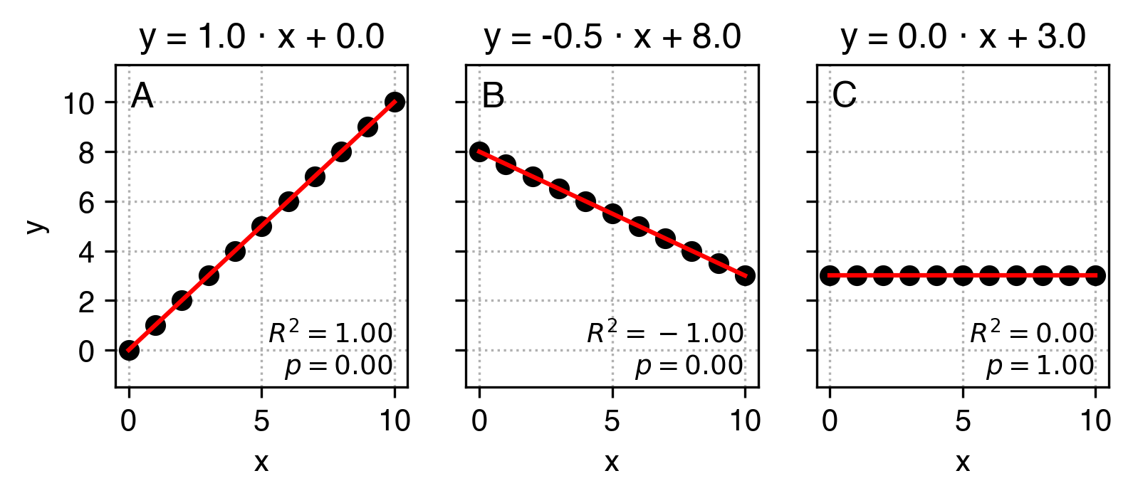
This is how we can read these plots:
-
In plot A parameter
a equals 1 and parameter b equals 0. That means that an increas by 1 in x corresponds to an increase in y also by 1, and when x equals 0, y also equals 0.
In plot B parameter a equals -0.5 and parameter b equals 4. That means that an increase by 1 in x corresponds to a decrease in y by 0.5, and when x equals 0, y equals to 8.
In plot C parameter a equals 0 and parameter b equals 3. That means that an increas by 1 in x does not correspond to any change in y - these variables are not correlated, and y equals to 3 regardless of x.
In practice, the data is never so clean that y can be perfectly predicted from x using just two parameters a and b, but we can use linear regression to find the a and b parameters that best approximate this relation. Have a look at the example below:
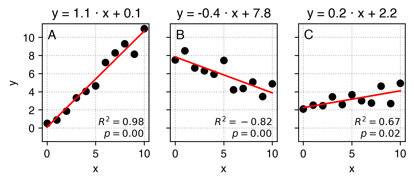
What I did here is that I added some noise to the original y data and used linear regression to find a and b values that best describe the relation between x and the modified y. Ideally, it would find the same a and b values as in the example above. We can see they are really close, but not exactly the same.
When running linear regression in python, apart from a (gradient, or slope) and b (intercept) parameters, we also get:
-
the R2 score which indicates how well our linear fit describes the relationship between
x and y compared to a flat line. When it's equal to 1, the description is perfect, when it's 0, it's not better than a flat line, and when it's negative, it's better than random again but indicates that the relation between the variables is inverse.
the pvalue, which roughly indicates how likely we would get such a result or stronger if there was actually no underlying relationship (a=0). By convention, if the pvalue is low, (pvalue<0.05) we assume that the relationship exists. If it's higher, we can't assume so. It might not seem clear, and it shall remain unclear as the actually meaning and interpretation of p values evades most data scientists and other practitioners.
the standard error (uncertainty) of the slope.
You can see in the C plot that our linear regression fit suggests that x and y are correlated, even though they aren't. We'll later learn how to try and minimize the probability of falling in such traps.
Exercise 3: Linear regression
To perform linear regression we will use the scipy.stats package and its linregress function:
slope, intercept, r_squared, p_val, std_err = linregress(x, y)
-
Perform linear regression to find the relation between the temperature and the number of bike trips.
In a markdown cell interpret the resulting slope and intercept.
Create a scatter plot with temperature on the x-axis and number of trips on the y-axis in black (remember to label your axes!)
Now we want to present the resulting regression line like in the examples. To do that, modify the cell that generates the scatter plot to:
-
find the minimum and the maximum value of temperatures.
calculate the corresponding estimations of number of trips (remember, y = a * x + b) for each of these values.
use
plt.plot([temp_min, temp_max], [trips_est_min, trips_est_max], 'r') to plot the result in the same cell as your scatter plot.
use plt.title(YOUR_TITLE_GOES_HERE_AS_A_STRING) to set the title similar to that in the examples.