Jupyter notebook
Jupyter Notebook is a tool which you will use to deliver your final project. It allows writing and executing python code, as well as inserting rich text and images in the same document. When we're grading your final projects we will (hopefully) be able to run the code you wrote as we read the report.
Getting started
-
Jupyter Notebook came with your Anaconda python distribution. To start it, go to the terminal (command line) and type
jupyter notebook.
Your Internet browser should now have opened with the list of files in the folder from which you ran the command. Use it to navigate to your DS2001.
Create a new Python3 notebook using the menu in the top right. You should now see something like this: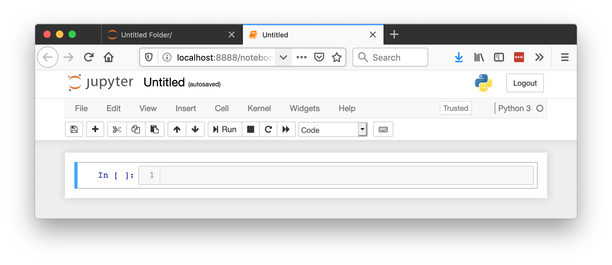 Change the name of the notebook from Untitled to Practicum 10.
Verify that everything works by typing
Change the name of the notebook from Untitled to Practicum 10.
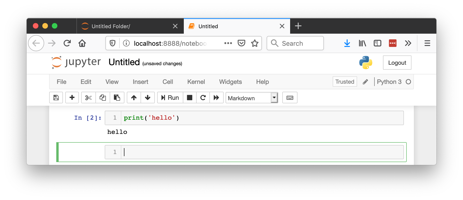
Verify that everything works by typing print('hello') into the cell. To run a cell, press Shift+Enter.
You can see the code executed and you were moved to a new cell. You call still go back to previous cells, add more code, or rerun them whenever necessary.
Make sure you save your changes by pressing Ctrl+S (Cmd+S on mac)!
To quit the notebook (don't do it now!) go to the terminal where you started it, press Ctrl+C (both Windows and Mac), then type y and press Enter.
Crash course on markdown
Text can be formated in the notebook using what's called Markdown. Here are a few basic things you'll need to know:
-
To start using markdown, change the type of the cell from Code to Markdown
 Use
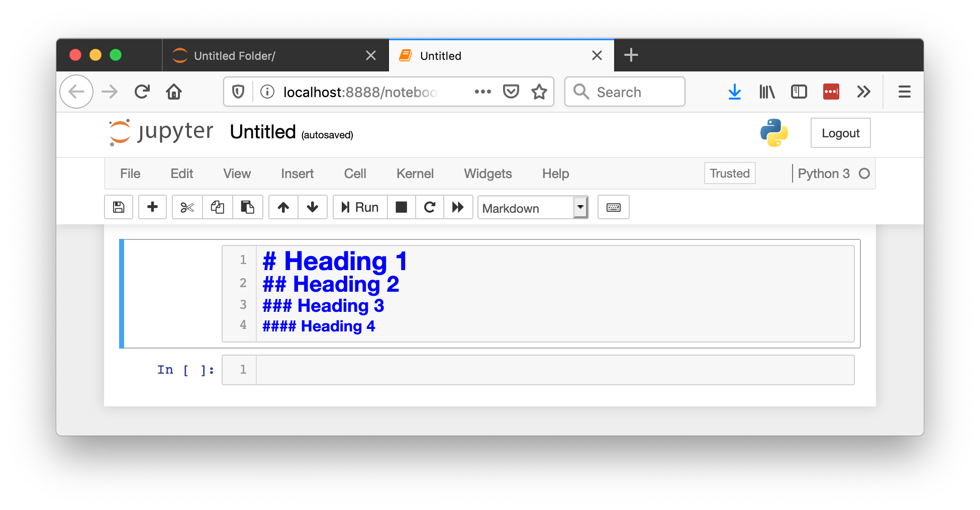
Use # hash symbols to create headings, the more hashes the lower the level of the heading. Remember to put a space between the hash and the actual heading:
 After you're done editing a markdown cell, run it by pressing Shift+Enter.
You can write equations in the TeX format by putting the math in between
After you're done editing a markdown cell, run it by pressing Shift+Enter.
You can write equations in the TeX format by putting the math in between $ dollar signs, like that: , even in the middle of the sentece. $P(E) = {n \choose k} p^k (1-p)^{ n-k}$
You can link to an external webpage like this: [What the user will see in square brackets](https://example.com/)
You can create bullet point lists by starting the line with the * asterisk character.
Excercise 1: Markdown
Create a markdown cell in your notebook. In that cell:
-
Make a level-1 heading that says "Exercise 1"
As bullet points write out:
-
the formula for the Pythagorean theorem;
the formula for the gravitational force (
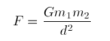 )
)
Crash course on data visualization
In this part we will learn basic types of plots: line plot, histogram, and scatter. We will need to import the plotting library, matplotlib.-
Create a new cell of type Code (not Markdown).
In that cell paste the following code:
%matplotlib inline
plt. The second one instructs the jupyter notebook to place the figures directly in the notebook (not in a new window as is by default).
Run this cell and go to a new one.
Now we will need some data to plot. Let's use these three lists of min, average, and max temperatures over one month in Boston (copy and paste them into your new cell):
hi_temp = [23,35,39,63,65,44,42,57,36,37,37,38,43,40,52,49,34,32,34,31,48,46,38,47,42,32,26]
avg_temp = [17,25,33,49,53,39,39,48,31,31,32,29,38,36,42,40,29,27,26,26,37,41,34,41,36,26,20]
days = range(1, len(avg_temp)+1)
plt.xlabel('Day of the month')
plt.ylabel('Temperature')
plt.plot(days, lo_temp)
plt.plot(days, hi_temp)
plt.xlabel('Day of the month')
plt.ylabel('Temperature')
label them and show the legend, like this:
plt.plot(days, lo_temp, label='low')
plt.plot(days, hi_temp, label='hi')
plt.xlabel('Day of the month')
plt.ylabel('Temperature')
plt.legend()
Excercise 2: Changing the line colors
-
Use this webpage to learn how to change the color of the line plots.
Configure your lines so that average temperature is in black, lows are blue, and the highs are red.
Excercise 3: Histograms
We use histograms to learn about the distribution of the data. Create a new code cell in your notebook. Then:
-
Use
plt.hist(data) (histogram does not take x, just the data) to create a histogram of daily average temperatures.
Make sure you label the axes correctly!
plt.hist() by default groups the data into 10 bins. You can change that by specifying the optional parameter like this:plt.hist(data, bins=11). Experiment with the number of bins and find a number that you think works best: it should be large enough to show the variety of temperatures, but not too large: when every day is in it's own bin we don't really learn anything from the histogram!
Excercise 4: Scatter plots
We can visualize that two variables are correlated (or not) using a scatter plot. Have a look at the example scatter plots of correlated and uncorrelated variables here.
Part #1
Let's find out if daily lows and highs are correlated. Create a new code cell in your notebook. Then:
-
Use
plt.scatter(variable1, variable2) to find out whether daily lows and highs are correlated.
Make sure you label the axes correctly!
Part #2
OK. That was pretty obvious. What's more interesting is finding out if we can predict the temperature of tomorrow knowing the temperature today. To do that, create a new cell and:
-
Use
plt.scatter(variable1, variable2) in a way where variable1 and variable2 both represent the daily average temperatures, but variable2 is offset by a day. That means variable1 will be the data for all the days apart from the last, and variable2 is the data for all the days apart from the first.
Make sure you label the axes correctly!